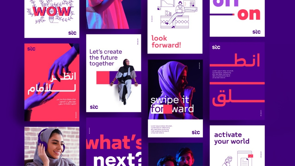
Interbrand develops the new brand for stc
Interbrand, the world’s largest brand consulting firm, has spearheaded the development of the strategic and creative rebrand for stc, the leading digital company in MENA.
Nancy Villanueva, Interbrand’s CEO Iberia & Middle East, states: “Interbrand is proud of developing stc’s brand, the best digital company in MENA region according to Forbes Magazine ranking”. She added: “The visual identity was designed to focus on simpler, bolder and more iconic elements that transmit a forward-thinking strategy and represent a unique and solid story. This is primarily achieved through a key visual we call the “slider”: ‘making everything move towards the future’.”
“This is not just a mere cosmetic change, but a complete cultural change which aims to further their digital innovation leadership,” Nancy Villanueva clarified.
The rebrand represents a pivotal change for the company which leads a digital transformation in Saudi Arabia and the region, aiming to unify the brand in all its markets (KSA, Bahrain and Kuwait) and establishing a consistent brand promise in all these markets.
The purpose transcends that of a traditional telco operator and instead connects to people’s real and growing needs: “Creating and bringing greater dimensions and richness to people’s personal and professional lives”. This is the ambition as it evolves its internal and external processes, as well as a corporate culture that highlights drive, devotion and dynamism.
The creative direction of the identity “Everything’s going forward!” is what inspired the visual identity that aims to trascend the telco category. The brand now speaks about the future and seamless progress. In order to express these concepts in a simple, human, youthful and innovative way, Interbrand created a metaphor that emanates from corporate brand strategy. The “slider” represents this digital and human movement that transforms, when people interact with screens.
The “slider” is the essence of the visual identity and is encapsulated in the current logo – specifically, the “slider” resource intervenes in a simple and iconic way in the “t”. The logo no longer has a symbol as the name itself becomes the symbol, moving from capital letters to lowercase conveying closeness and proximity creating a younger, modern and more digital expression.
The font stc Forward has been developed, an ad hoc typography that encompasses the Latin and Arabic families and incorporates the dynamics of the “slider” in its hyperextended horizontal strokes. Always with a sense of movement and it ask for you to interact with it. Allowing more engaging and iconic communication.


